
Colour JSS2 Cultural & Creative Arts (CCA) Lesson Note
Download Lesson NoteTopic: Colour
COLOUR
Subject: Creative Arts (Cultural and Creative Arts)
Class: JSS2
Duration: 40 minutes
Colour is what we see when light hits an object and bounces back to our eyes. Everything around us has colour – the sky, trees, clothes, food, and even our skin. Colours make our world beautiful and interesting to look at.
Imagine if everything was just black and white, like an old photograph. It would be very boring! Colours help us enjoy the world around us. They also help us understand things better. For example, we know that a ripe banana is yellow and a fresh leaf is green.
Colours can make us feel different emotions too. When you see red, you might feel excited or energetic. When you see blue, you might feel calm and peaceful. Artists use colours to express feelings and create moods in their artwork.
Why Do We See Different Colours?
We see colours because of light. When sunlight shines on an object, the object absorbs some colours and reflects others back to our eyes. The colour that bounces back is what we see.
For example, when light hits a red apple, the apple absorbs all the colours except red. The red colour bounces back to our eyes, so we see the apple as red. This is how colour works in nature.
Without light, we cannot see colours. Try looking at colours in a very dark room – you will notice that everything looks grey or black. When you turn on the light, suddenly all the colours appear again!
Sources of Local Colours
Local colours are colours that we can find naturally in our environment and community. These are colours that people have been using for hundreds of years, long before factories started making paint and dyes.
Natural Sources of Colours:
- From Plants
Many plants give us beautiful colours:
- Leaves give us green colour. You can crush fresh leaves and use the juice for colouring.
- Flowers provide different colours. Hibiscus flowers give red or pink. Yellow flowers give yellow dye.
- Bark of trees like the camwood tree gives orange or red colour.
- Roots from certain plants can give yellow or brown colours.
- Indigo plant gives a deep blue colour. Our ancestors used this plant to dye cloth blue.
- Henna leaves give orange-brown colour. Many people use this to decorate their hands and dye their hair.
- From Soil and Earth
The ground beneath our feet has many colours:
- Red soil found in many parts of Africa gives us red and orange colours.
- Clay comes in different colours – brown, red, white, or grey.
- Charcoal from burnt wood gives us black colour.
- White clay or chalk gives us white colour.
- People used to mix these soils with water or oil to make paint for decorating houses and creating traditional art.
- From Fruits and Vegetables
Many things we eat can also give us colour:
- Tomatoes give red colour
- Carrots give orange colour
- Beetroot gives deep red or purple
- Onion skins give yellow or brown colour
- Spinach and other green vegetables give green
- Palm oil gives orange-red colour
- From Other Natural Sources
- Ashes mixed with water give grey colour
- Rust from old iron gives reddish-brown
- Mud gives various shades of brown
- Stones can be crushed to make different coloured powders
Our grandparents and great-grandparents used all these natural sources to make colours for painting, dyeing cloth, and decorating their homes. Even today, many artists prefer natural colours because they are safe and environmentally friendly.
Classification of Colours
Just like we organize books in a library, we organize colours into groups. This helps us understand how colours work and how to mix them. There are three main groups of colours.
PRIMARY COLOURS

Primary colours are the most important colours. They are called primary because they are the first colours – you cannot make them by mixing other colours together. They are like the parents of all other colours.
The three primary colours are:
- RED – This is a warm, bright colour. Think of a ripe tomato, blood, or a stop sign.
- YELLOW – This is a cheerful, sunny colour. Think of a ripe banana, the sun, or a marigold flower.
- BLUE – This is a cool, calm colour. Think of the sky on a clear day or the ocean.
These three colours are very special. If you have red, yellow, and blue paint, you can mix them to create almost any other colour you want! That is why artists always make sure they have these three colours.
In school, when you buy a paint set, it always includes red, yellow, and blue because these are the foundation colours you need.
SECONDARY COLOURS
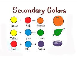
Secondary colours are colours you get when you mix two primary colours together. They are called secondary because they come second – after the primary colours.
The three secondary colours are:
- ORANGE
You make orange by mixing RED + YELLOW.
Think of an orange fruit, a carrot, or a sunset.
If you mix more red than yellow, you get a red-orange colour. If you mix more yellow than red, you get a yellow-orange colour. Artists often adjust the mixture to get exactly the shade they want.
- GREEN
You make green by mixing YELLOW + BLUE.
Think of fresh grass, tree leaves, or an unripe mango.
When you mix equal amounts of yellow and blue, you get a medium green. More yellow makes it lighter and brighter green (like lime). More blue makes it darker green (like forest green).
- PURPLE (or VIOLET)
You make purple by mixing RED + BLUE.
Think of an eggplant, grapes, or some flowers.
Purple can look very different depending on how you mix it. More red makes it look like magenta or hot pink. More blue makes it look deep violet. Equal amounts give you a true purple.
Let us remember this important fact: Primary + Primary = Secondary
TERTIARY COLOURS
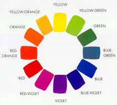
Tertiary means third. Tertiary colours come third in our colour family. You make tertiary colours by mixing a primary colour with a secondary colour that is next to it.
The six tertiary colours are:
- RED-ORANGE
Mix red (primary) with orange (secondary)
This is a fiery, warm colour like flames or a tropical sunset.
- YELLOW-ORANGE
Mix yellow (primary) with orange (secondary)
This is like the colour of a ripe mango or marigold flowers.
- YELLOW-GREEN
Mix yellow (primary) with green (secondary)
This is a fresh, spring-like colour, like new grass or lime.
- BLUE-GREEN
Mix blue (primary) with green (secondary)
This is like turquoise or the colour of shallow tropical water.
- BLUE-PURPLE
Mix blue (primary) with purple (secondary)
This is a deep, rich colour like certain flowers or the evening sky.
- RED-PURPLE
Mix red (primary) with purple (secondary)
This is like magenta or the colour of some roses.
Tertiary colours give us more options when we paint. They help us create more realistic pictures because not everything in nature is exactly primary or secondary colours. Most colours we see around us are actually tertiary colours or mixtures of many colours.
The Colour Wheel
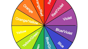
If you arrange all these colours in a circle, you create what is called a colour wheel. The colour wheel shows us how colours relate to each other:
Primary colours are equally spaced around the wheel
Secondary colours sit between the two primary colours used to make them
Tertiary colours sit between the primary and secondary colours
The colour wheel is a useful tool that helps artists choose colours that work well together.
Warm and Cool Colours

Colours can also be grouped as warm or cool, based on the feelings they give us.
Warm Colours:
These are colours that remind us of fire, sun, and heat. They make us feel energetic and excited.
- Red
- Orange
- Yellow
- Red-orange
- Yellow-orange
Cool Colours:
These are colours that remind us of water, sky, and shade. They make us feel calm and peaceful.
- Blue
- Green
- Purple
- Blue-green
- Blue-purple
COLOUR HARMONY
Harmony means things that go well together and create a pleasant feeling. Colour harmony is about choosing colours that look good together when you use them in the same artwork.
When colours have harmony, they do not fight with each other. They work together to create something beautiful, just like singers in a choir blend their voices to make beautiful music.
Ways to Create Colour Harmony:
- Using Similar Colours
Choose colours that are next to each other on the colour wheel. These are called analogous colours.
Examples:
- Blue, blue-green, and green
- Red, red-orange, and orange
- Yellow, yellow-green, and green
This creates a peaceful, harmonious feeling because the colours flow naturally from one to another.
- Using Opposite Colours
Choose colours that are across from each other on the colour wheel. These are called complementary colours.
Examples:
- Red and green
- Blue and orange
- Yellow and purple
When you put complementary colours next to each other, they make each other look brighter and more vibrant. This creates energy and excitement in your artwork.
- Using Different Shades of One Colour
This means using the same colour but in lighter and darker versions. For example:
- Light blue, medium blue, and dark blue
- Pale yellow, bright yellow, and mustard yellow
- Pink, red, and dark red
This is called monochromatic harmony. It creates a calm, unified look.
- Using Warm or Cool Colours Together
Keep all your colours either warm or cool:
- All warm: red, orange, yellow, red-orange
- All cool: blue, green, purple, blue-green
This creates a strong mood – warm colours for energy and excitement, cool colours for peace and calm.
Tips for Good Colour Harmony:
- Do not use too many bright colours together or your artwork will look confusing
- Balance bright colours with neutral colours like white, grey, black, or brown
- Repeat one colour in different parts of your artwork to tie everything together
- Think about the feeling you want to create before choosing your colours
Practical Activities with Colour
Activity 1: Mixing Primary Colours
Get red, yellow, and blue paint. Try mixing them:
- Mix red + yellow to make orange
- Mix yellow + blue to make green
- Mix blue + red to make purple
Notice how the amount of each colour changes the result.
Activity 2: Creating Natural Colours
- Try making colours from natural sources:
- Crush some leaves to get green juice
- Squeeze a tomato for red
- Mix some red soil with water for brown paint
Activity 3: Making a Colour Wheel
Draw a circle and divide it into 12 sections. Paint the primary colours first (red, yellow, blue), then the secondary colours between them, then the tertiary colours.
Activity 4: Finding Colour Harmony
Look at pictures in magazines or books. Notice which colours are used together. Do they create harmony? Are they warm or cool? Are they similar or opposite colours?
First Term Cultural & Creative Arts (CCA) Lesson Notes for Other Topics

Introduction to Drawing - Objects in Our Environment
Explore lesson notes covering all topics.

Introduction to Singing
Explore lesson notes covering all topics.

Singing About Flowery Plants Using Tonic Solfa
Explore lesson notes covering all topics.

Staging - The Way a Play is Produced and Presented
Explore lesson notes covering all topics.

Types of Flowers
Explore lesson notes covering all topics.

Drawing of Staff/Stave, The Grand Staff, and The Clefs
Explore lesson notes covering all topics.

Use of Lines
Explore lesson notes covering all topics.
Theatrical Elements and Personnel
Explore lesson notes covering all topics.
Forms of Dance
Explore lesson notes covering all topics.
Imaginative and Creative Drawing
Explore lesson notes covering all topics.

Choral Singing
Explore lesson notes covering all topics.

Casting and Rehearsal
Explore lesson notes covering all topics.
Card Making and Decoration
Explore lesson notes covering all topics.
Introduction to Life Drawing
Explore lesson notes covering all topics.

Rhythmic Pattern 2
Explore lesson notes covering all topics.


Lesson Notes for Other Classes

Basic 1 Lesson Note
The complete lesson note to guide your studies.

Basic 2 Lesson Note
The complete lesson note to guide your studies.

Basic 3 Lesson Note
The complete lesson note to guide your studies.

Basic 4 Lesson Note
The complete lesson note to guide your studies.
Basic 5 Lesson Note
The complete lesson note to guide your studies.

Basic 6 Lesson Note
The complete lesson note to guide your studies.