Data Presentation – Basic 5 Mathematics Lesson Note (Third Term)
Download Lesson NoteLesson note at a glance
- Subject
- Mathematics
- Class
- Basic 5
- Term
- Third Term
- Topic
- Data Presentation
- Order
- Topic 8 of 8 this term
- Reading time
- 1 min
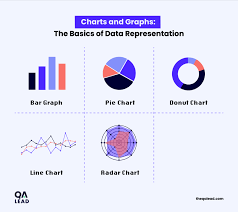
Data Presentation
Topic: Data Presentation
Data presentation is the representation of data or information for easy reading and interpretations.
Data can be presented in pictograms, bar graphs or frequency tables.
Pictogram
A pictogram is the representation of data using pictures. For example, the following are types of vehicle that passes through a street in an hour.
🚲🚲🚲 = 3 bicycles
🚗🚗🚗🚗🚗 = 5 cars
🐪🐪🐪🐪🐪🐪🐪 = 7 camels
🚌🚌🚌🚌 = 4 buses
🚛🚛🚛🚛🚛🚛 = 6 lorries
Bar Graph
It is a way of representing information pictorially, using rectangular bars of equal widths. The spaces between the bars are the same. The height of the bar represents the number of times the event occurs. A bar graph can be horizontal or vertical.
The graph below shows the number of pupils who like different fruits.
Evaluation
Question 1
The table below shows how Pupils in class 5 of Island Builders Baptist School travel to school:
| Method of travel | No. of pupils |
| Bicycle | 7 |
| Walk | 18 |
| Bus | 10 |
| Car | 12 |
Tasks:
- Draw a bar graph to show the information above:
- What is the most preferred method of travel?
- How many more Pupils travel by car than bus?
Solutions
Answer to Question 2: Walking is the most preferred method of travel (18 pupils).
Answer to Question 3: Car travelers (12) – Bus travelers (10) = 2 more pupils travel by car than bus.
Bar Graph for Transportation Data

Key Learning Points
- Pictograms use pictures or symbols to represent data
- Bar graphs use rectangular bars to show data visually
- The height or length of bars represents the frequency or amount
- Bar graphs make it easy to compare different categories of data
- Always include labels and titles for clear understanding
This term's Mathematics topics
Basic 5 Third Term · 8 topics
Third Term Mathematics Lesson Notes for Other Topics
Numbers 1-250
Read the full lesson note.
Data Collection
Read the full lesson note.
Numbers 241-250
Read the full lesson note.
Numbers 231-240
Read the full lesson note.
Two-Dimensional Shapes
Read the full lesson note.

Numbers 221-230
Read the full lesson note.
Weight
Read the full lesson note.
Numbers 211-220
Read the full lesson note.
Length Measurement
Read the full lesson note.
Numbers 201-210
Read the full lesson note.
Money (Continued)
Read the full lesson note.
Numbers 190-200
Read the full lesson note.
Nigerian Currencies
Read the full lesson note.
Numbers 181-190
Read the full lesson note.
Subtraction
Read the full lesson note.
Lesson Notes for Other Classes

Basic 1 Lesson Note
The complete lesson note to guide your studies.
Basic 2 Lesson Note
The complete lesson note to guide your studies.

Basic 3 Lesson Note
The complete lesson note to guide your studies.
Basic 4 Lesson Note
The complete lesson note to guide your studies.
Basic 6 Lesson Note
The complete lesson note to guide your studies.
JSS1 Lesson Note
The complete lesson note to guide your studies.