Graphs JSS3 Computer Studies Lesson Note
Download Lesson NoteTopic: Graphs
A graph is a diagram showing the relationship that exists among variables and quantities (varies data), usually of two, each measured along one of a pair of axes at right angles. It may not be possible to plot a graph without value. The Excel spreadsheet provides the values that are plotted.
Creating a Graph
To create a graph, you can either use the chart wizard or press the F11 key.
Types of Chart
Line graph
Histograms
Pie-charts
Legends
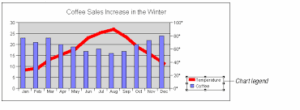
Line Graph

Line graphs are often used to plot changes in data over time, such as monthly temperature changes or daily changes in stock market prices. Line graphs have a vertical axis and a horizontal axis. If you are plotting changes in data over time, time is plotted along the horizontal or x-axis and your other data, such as rainfall amounts is plotted as individual points along the vertical or y-axis.
Histogram
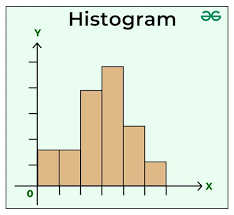
A histogram consists of tabular frequencies, shown as adjacent rectangles, erected over discrete intervals (bins), with an area equal to the frequency of the observations in the interval. The height of a rectangle is also equal to the frequency density of the interval.
Pie Charts

Pie charts, or circle graphs as they are sometimes known, are a little different from the other two types of graphs discussed.
For one, pie charts do not use horizontal and vertical axes to plot points like the others. They also differ in that they are used to chart only one variable at a time. As a result, it can only be used to show percentages. The circle of the pie chart represents 100%. The circle is subdivided into slices representing data values. The size of each slice shows what part of the 100% it represents.
Legends
A legend is used to identify each series in a chart. It contains on sample of the marker colour and pattern of each series.
EVALUATION
Define chart.
List the various types of charts you are familiar with in MS Excel.
Second Term Computer Studies Lesson Notes for Other Topics
System Application
Explore lesson notes covering all topics.
Important Computer Applications
Explore lesson notes covering all topics.
Difference Between Hardware And Software
Explore lesson notes covering all topics.

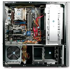
Components Of CPU
Explore lesson notes covering all topics.

More Parts Of The CPU
Explore lesson notes covering all topics.
Arithmetic Logic Unit (ALU) & Storage Unit in CPU
Explore lesson notes covering all topics.

Input Devices
Explore lesson notes covering all topics.

Launching Microsoft Word
Explore lesson notes covering all topics.

Mini And Micro Computers
Explore lesson notes covering all topics.

Mainframe And Super Computers
Explore lesson notes covering all topics.

Computer Icons
Explore lesson notes covering all topics.
Setting Of A Computer
Explore lesson notes covering all topics.
Electronic Mails
Explore lesson notes covering all topics.
Hyper Text Mark-up Language (HTML) document
Explore lesson notes covering all topics.

Internet Safety
Explore lesson notes covering all topics.

Lesson Notes for Other Classes

Basic 2 Lesson Note
The complete lesson note to guide your studies.
Basic 3 Lesson Note
The complete lesson note to guide your studies.

Basic 4 Lesson Note
The complete lesson note to guide your studies.
Basic 5 Lesson Note
The complete lesson note to guide your studies.

JSS1 Lesson Note
The complete lesson note to guide your studies.
JSS2 Lesson Note
The complete lesson note to guide your studies.