Statistics -Data Representation (Bar Chart And Pie Charts) JSS2 Mathematics Lesson Note
Download Lesson NoteTopic: Statistics -Data Representation (Bar Chart And Pie Charts)
STATISTICS – DATA PRESENTATION
FREQUENCY TABLE
EXAMPLE 1: The following figures show the number of children per family in a sample of 40 households. 1, 2, 4, 3, 5, 3, 8, 3, 2, 3, 4, 5, 6, 5, 4, 2, 1, 3, 2, 4, 5, 3, 8, 7, 6, 5, 4, 5, 7, 6, 3, 8, 6, 3, 5, 7, 5, 4, 3.
a. Use a tally mark to prepare a frequency table for the data
b. What is the highest frequency of the number of children per family?
Solution
| NUMBER | TALLY | FREQUENCY |
| 1 | // | 2 |
| 2 | ///// | 5 |
| 3 | //// //// | 9 |
| 4 | //// / | 6 |
| 5 | //// /// | 8 |
| 6 | //// | 4 |
| 7 | /// | 3 |
| 8 | /// | 3 |
| 40 |
Example 2: In a further mathematics test the following marks were obtained by a group of students 85, 75, 95, 80, 75, 80, 90, 84, 95, 84, 85, 80, 80, 75, 80, 75, 80, 84, 81, 80, 75, 90, 80.
Use a tally mark to prepare a frequency table for this data.
Solution:
NUMBER TALLY FREQUENCY
75 //// 5
80 //// 9
81 / 1
84 /// 3
85 // 2
90 /// 3
95 // 2
a. How many students took part in the test? 25 students
b. Which mark had the highest frequency? 80 marks
AVERAGE, MEAN MEDIAN AND MODE
Average is a single value used to represent a set of numbers (i.e all values in as et data)
The most commonly used statistic is average.
MEDIAN = THE NUMBER IN THE MIDDLE AFTER THE ARRANGEMENT OF THE DATA.
MODE IS THE VALUE THAT OCCURS MOST FREQUENTLY.
EXAMPLES: Calculate the mean, median, and mode of the following data
a. 45, 50, 55, 54, 48, 53, 50, 55
b. 38, 35, 36, 30.8, 34.7, 37.9, 33.1
c. 3, 0,4,7, 0, 5, 3, 4, 0, 3, 6, 5, 5,4, 6, 5
Solution:
Mean = 45+50+ 55+ 54+ 48+ 53+ 50+ 55
8
= 410/8
= 51.25
Median = 45, 48, 50, 50, 53, 54, 55,55
50 + 53
2
= 52
Mode = 50 and 55
Average
The average or mean of a set of numbers is defined by the formula:
Example
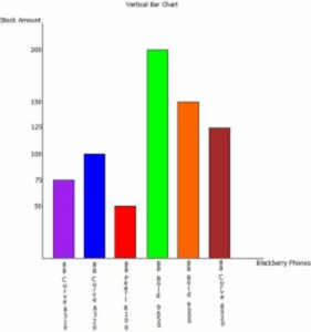
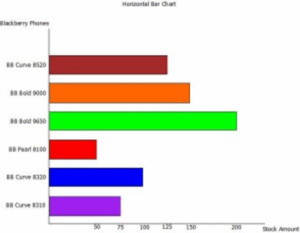
Bar Charts
A Bar chart is a series of rectangular bars of the same width, drawn vertically or horizontally, with an equal space between them, with the height of each bar being a depiction of the data it is representing.
Example
The table below lists several models of Blackberry cellular phones and the amount of each that an electronic store has in stock. Draw a vertical and horizontal bar chart to represent the data.
| Blackberry Phones Stock | Amount |
| Blackberry Curve 8310 | 75 |
| Blackberry Curve 8320 | 100 |
| Blackberry Pearl 8100 | 50 |
| Blackberry Bold 9650 | 200 |
| Blackberry Bold 9000 | 150 |
| Blackberry Curve 8520 | 125 |
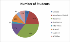
Pie Charts
A Pie chart is a circular diagram divided into sectors, with the size of each sector representing the magnitude of data it is depicting. Each sector of a pie chart can either be displayed in percentages (note all sectors must add up to 100%) or as an angle (note all sectors must add up to 360o).
Example
The table below lists some of the most popular football clubs and the number of students at a given institution that supports each. Use a Pie chart to represent the information given in the table.
| Football Clubs | Number of Students |
| Chelsea | 50 |
| Manchester United | 200 |
| Barcelona | 350 |
| Real Madrid | 150 |
| Inter Milan | 25 |
| Arsenal | 100 |
| Liverpool | 40 |
| AC Milan | 75 |
The Pie Chart above depicts each sector as percentages. To calculate the percentages for each sector use the formula below:
% of a sector = Number of students x 100
Total number of students
So, to calculate the percentage of Chelsea fans:
% of Chelsea fans = 50 x 100
990
% of Chelsea fans = 5%
For Pie charts that depict each sector as angles, the angles for each sector are found using the formula below:
The angle of a sector = Number of students x 360
Total number of students
So, to calculate the angle of the Chelsea sector:
Angle of Chelsea sector = 50 x 360
990
Angle of Chelsea sector = 18 de
Note: In most cases, the questions set on Pie charts require those drawn depicting sectors in percentages.
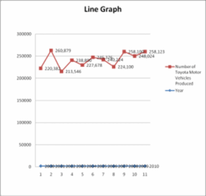
Line Graphs
Line graphs are mostly used in depicting trends, and as such, values are in most cases plotted against time. A line graph is drawn by connecting a line to consecutive values, with a circle/point made at each value being depicted.
Example
The table below lists the amount of Toyota motor vehicles produced in April over the period 2000- 2010.
Year Number of Toyota Motor Vehicles Produced
2000 220,382
2001 260,879
2002 213,546
2003 238,890
2004 227,678
2005 245,376
2006 240,224
2007 224,100
2008 258,100
2009 248,024
2010 249,123

Third Term Mathematics Lesson Notes for Other Topics

Longitude and Latitude II
Explore lesson notes covering all topics.

Bearings
Explore lesson notes covering all topics.
Probability
Explore lesson notes covering all topics.

Graph Of Linear Inequality In Two Variables
Explore lesson notes covering all topics.

Application Of Linear Inequality In Real Life
Explore lesson notes covering all topics.

Statistics
Explore lesson notes covering all topics.

Probability
Explore lesson notes covering all topics.

Graphical Presentation of Data & Frequency Distribution
Explore lesson notes covering all topics.

Collection, Tabulation & Presentation of Grouped Data
Explore lesson notes covering all topics.

Area And Volume Of Frustum
Explore lesson notes covering all topics.

Surface Area And Volume Of Solid Shapes
Explore lesson notes covering all topics.

Area Of Sector And Segment
Explore lesson notes covering all topics.

Mensuration: Circle and It's Properties
Explore lesson notes covering all topics.

Angles of Elevation And Depression
Explore lesson notes covering all topics.

Angles And Polygons
Explore lesson notes covering all topics.


Lesson Notes for Other Classes

JSS1 Lesson Note
The complete lesson note to guide your studies.

SS1 Lesson Note
The complete lesson note to guide your studies.

SS2 Lesson Note
The complete lesson note to guide your studies.

SS3 Lesson Note
The complete lesson note to guide your studies.