Correlation & Regression SS3 Further Mathematics Lesson Note
Download Lesson NoteTopic: Correlation & Regression
SPECIFIC OBJECTIVES: At the end of the lesson, students should be able to;
- Illustrate data on a scatter diagram;
- Identify the type of relationship; evident from a scatter diagram;
- Rank a given distribution;
- Calculate the rank correlation coefficient of two distributions;
- Interpret correlation coefficients
INSTRUCTIONAL RESOURCES:
Real-life data, i.e. scores, ages, height etc.
LESSON PRESENTATION: The teacher presents the lesson step by step by first asking the students questions based on previous lessons, for example, what is data? Etc.
STEP I
MODE: ENTIRE CLASS
Identification of prior ideals, for example, the teacher arouses students’ interest by asking them questions relevant to the lesson, for example, stating the type of data Etc.
TEACHER’S ACTIVITIES
CONCEPT OF CORRELATION AS MEASURE OF RELATIONSHIPS
CORRELATION
Definition: When two variables x and y are related they said to be CORRELATED
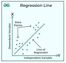
SCATTER DIAGRAM AND REGRESSION LINE
The best way to determine whether or not any relationship exists between two variables x and y is by drawing a scatter diagrams
SCATTER DIAGRAM
Definition: A scatter diagram is a graphic display of bivariate data
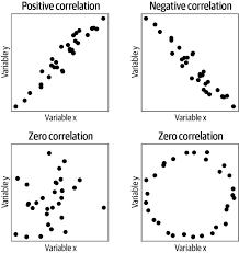
POSITIVE CORRELATION
A positive correlation between two variables x and y means that in general, an increase in x is accompanied by an increase in y
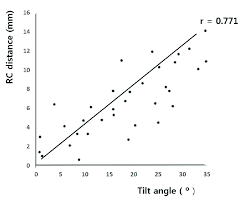 High positive correlation
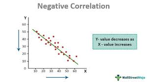
NEGATIVE CORRELATION
When an increase in x is accompanied by a decrease in y, the correlation between x and y is said to be negative and the corresponding regression line has a negative slope
ZERO CORRELATION
When there is NO apparent association between x and y, in that wise, x and y are said to have a zero correlation
REGRESSION LINE
The relationship between x and y is said to be linear if all the points lie on or near a line, if this happens, the line is called a regression line.
REGRESSION CURVE
When it appears that most of the points lie on or near a curve, which is parabolic in shape. The parabolic curve is called the regression curve
Non-linear correlation
Example: The table below shows the corresponding values of two variables A and B
| A(x) | 33 | 31 | 28 | 25 | 23 | 22 | 19 | 17 | 16 | 14 |
| B(y) | 4 | 6 | 4 | 10 | 12 | 10 | 14 | 15 | 18 | 22 |
- Plot a scatter diagram to represent data;
- Calculate 𝑥̅, the mean of x and 𝑦̅, the mean of y
- Draw the line of best fit to pass through (𝑥̅, 𝑦̅)
- From your graph in (c), determine the (𝑖) relationship between x and y (ii) Value of y when x is 20
Solution
𝑑. 𝑦 = 𝑎 + 𝑏𝑥
From graph 𝑎 = 24.5, intercept at the y-axis and b is the slope
Thus,
𝑦 = 24.5 − 0.681𝑥
- When x is 20, we substitute the value into the resultant equation
𝑦 = 24.5 − 0.681(20)
= 10.88
STUDENTS ACTIVITIES
- The table below gives the distribution of the population (in 000’s) of a city over 80 years
| Year(Y) | 10 | 20 | 30 | 40 | 50 | 60 | 80 |
| Population(P) | 9.0 | 10.2 | 12.0 | 13.9 | 15.9 | 20.1 | 22.7 |
If the population P, is linearly related to the year y, that is 𝑃 = ℎ + 𝑘𝑦, where h and k are constants,
- Plot the scatter diagrams
- Draw an eye-fitted line of best fit (least-square line).
- Use your graph to estimate the (i) Values of h and k (ii) Population in the year 90
- The table below shows the values of quantities x and y obtained in a laboratory experiment
| X | 0.0 | 0.5 | 1.0 | 1.5 | 2.0 | 2.5 | 3.0 |
| Y | 0.5 | 0.7 | 1.0 | 1.5 | 1.5 | 1.5 | 2.4 |
- Plot a scatter diagram for the data;
- Draw an eye-fitted line of best fit;
- using your graph, estimate the value of y when x is 3.5
STEP II
Exploration; a fact about the lesson objectives using the resources around, for example, real-life data, which is the score, ages etc
MODE: ENTIRE CLASS
TEACHER’S ACTIVITIES
The table below shows the price of a commodity in 2015 and the price of the same commodity in 2016 as #x and #y respectively
| Month | Jan. | Feb. | March | April | May | Jun | July | Aug. | Sep. | Oct. | Nov. | Dec. |
| 1.00 | 1.50 | 1.25 | 1.60 | 1.40 | 2.00 | 2.10 | 2.20 | 2.60 | 2.40 | 2.50 | 3.00 | |
| 8.00 | 8.20 | 8.15 | 8.25 | 8.30 | 8.60 | 8.80 | 8.65 | 8.70 | 8.50 | 8.90 | 8.40 |
- Plot scatter diagram for the data and draw on it a line of regression
- Find the regression equation and obtain the coefficient of regression of y on x
STUDENTS ACTIVITIES
Collect and tabulate any data, and use the data collected to;
- Plot a scatter diagram;
- Use your graph to draw eye-fitted best-fit
- Determine the relationship between the data collected
STEP III
Discussion of Spearman’s rank and Pearson formula
MODE: ENTIRE CLASS
TEACHER’S ACTIVITIES
SPEARMAN’S RANK CORRELATION COEFFICIENT
The Spearman’s rank correlation coefficient is denoted as 𝑟𝑘 and given as
Where D is the difference between the pairs of rankings
Example: The marks scored by four candidates in mathematics and chemistry are given as
| Mathematics | 4 | 2 | 1 | 3 |
| Chemistry | 3 | 1 | 2 | 4 |
- Calculate the Spearman’s rank correlation coefficient
Solution
First, we arrange the given data in descending order and rank them
| Mathematics | Ranking |
| 4 | 1 |
| 3 | 2 |
| 2 | 3 |
| 1 | 4 |
| Chemistry | Ranking |
| 4 | 1 |
| 3 | 2 |
| 2 | 3 |
| 1 | 4 |
Next, we prepare a table showing them as they occur in the original table and allocate the rank gotten
| Mathematics (x) | Chemistry (y) | 𝑅𝑥 | 𝑅𝑦 | 𝐷 = 𝑅𝑥 − 𝑅𝑦 | 𝐷2 |
| 4 | 3 | 1 | 2 | -1 | 1 |
| 2 | 1 | 3 | 4 | -1 | 1 |
| 1 | 2 | 4 | 3 | 1 | 1 |
| 3 | 4 | 2 | 1 | 1 | 1 |
| ∑ 𝐷2 = 4 |
6∑𝐷2 6(4)
𝑟𝑘 = 1 − 𝑁(𝑁2−1) = 1 − 4(42−1) = 0.6
There is a high positive correlation between mathematics and chemistry
STUDENTS ACTIVITIES
The marks scored by ten students in mathematics and physics in an examination are as follows
| Students | A | B | C | D | E | F | G | H | I | J |
| Mathematics | 85 | 75 | 59 | 43 | 74 | 69 | 62 | 80 | 54 | 63 |
| Physics | 92 | 72 | 62 | 48 | 85 | 73 | 46 | 74 | 58 | 50 |
Calculate the Spearman’s rank correlation coefficient (Ans. 0.8061)
STEP IV
Evaluation: Assessment for learning through questions relevant to the lesson objectives use of the three-point rubrics with three has the highest score and one the least for assessing learning outcome; for example, state formula for rank correlation Etc.
ASSIGNMENT
- The ranks of the marks scored in a test by 7 candidates in statistics and economics are given in the table below
| Subject | Ranks | ||||||
| Statistics | 4 | 7 | 5 | 1 | 2 | 6 | 3 |
| Economics | 2 | 5 | 6 | 3 | 1 | 7 | 4 |
Calculate the Spearman’s rank correlation coefficient (Ans. 0.714)
- If D is the difference between each of the ranks between 5 paired variables and ∑ 𝐷2 = 4 calculate Spearman’s rank
- The table below shows the marks obtained by ten students in mathematics and further mathematics
| Mathematics | 51 | 25 | 33 | 55 | 65 | 38 | 35 | 53 | 61 | 44 |
| Further Mathematics | 20 | 65 | 25 | 36 | 51 | 50 | 77 | 31 | 60 | 05 |
Calculate the rank correlation coefficient between the two subjects
REFERENCES
- Further mathematics for SS3 by P.N Lassa and S.A Ilori
- Hidden Facts in Further Mathematics page 273
- New Further Mathematics Project 2 page 313

First Term Further Mathematics Lesson Notes for Other Topics
Sequence And Series II
Explore lesson notes covering all topics.
Sequence And Series
Explore lesson notes covering all topics.

Binary Operations
Explore lesson notes covering all topics.
Linear Inequalities
Explore lesson notes covering all topics.

Surds
Explore lesson notes covering all topics.
Indices And Logarithm
Explore lesson notes covering all topics.

Sets II - Operation of Set & Venn Diagrams
Explore lesson notes covering all topics.

Sets
Explore lesson notes covering all topics.
Partial Fraction
Explore lesson notes covering all topics.
Probability Distribution And Approximation
Explore lesson notes covering all topics.

Variance
Explore lesson notes covering all topics.
Matrices and Determinant
Explore lesson notes covering all topics.

Inequalities
Explore lesson notes covering all topics.

Lesson Notes for Other Classes

JSS1 Lesson Note
The complete lesson note to guide your studies.
JSS2 Lesson Note
The complete lesson note to guide your studies.

SS1 Lesson Note
The complete lesson note to guide your studies.

SS2 Lesson Note
The complete lesson note to guide your studies.