Graphical Presentation of Data & Frequency Distribution SS1 Mathematics Lesson Note
Download Lesson NoteTopic: Graphical Presentation of Data & Frequency Distribution
GRAPHICAL PRESENTATION OF DATA
The diagrammatic representation of collected data is known as the graphical presentation. Statistical data is interpreted from graphs, then the use of a frequency distribution table, as the graphs give a very clear picture of data. There are various diagrams or graphs associated with statistics some of these are; bar charts, pie charts, histograms, cumulative curves (Ogive), frequency polygon and frequency curves.
- THE BAR CHART
This is the use of rectangular bars to represent collected data. Each of the bars in the bar chart is of the same width but different heights, the height of which is proportional to the frequency of the distribution. i.e. the higher the frequency, the taller the bars and the lower the frequency the shorter the bar. In between each of the bars are gaps which are also equal in width. The spaces and the width of each bar don’t need to be the same. A bar chart is used to display qualitative and discrete data. The frequencies are recorded along the vertical axis while the variables are recorded along the horizontal axis.
EXAMPLE:
The table below shows the number of bottles of soft drinks sold in GODSHEPHRD restaurant on a Thursday.
Draw a bar chart to display the information and the modal drink.
| Types of Soft Drinks | No. Of Bottles |
| Coke | 12 |
| Fanta | 10 |
| Sprite | 6 |
| Lemon | 2 |
| Pepsi | 8 |
| Viju Milk | 8 |
| Caprison | 4 |
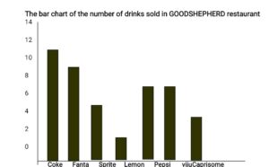
From the above bar chart, the tallest bars are that of Coke, with a frequency of 12. Hence the modal drink is Coke
There are other forms of BAR CHART and they are compound bar charts and Composite bar chart
Compound Bar Chart: It is used to compare two or more sets of information
PIE CHART: This is also known as divided Circles. A pie chart is a circle divided into sectors. Each angle in the sector is proportional to the frequencies. The higher the frequency the higher the Sectoral angles and the larger the sector. To prepare a pie chart, a frequency table is necessary, to display the Variables, frequencies and the Sectoral angles.
Sectoral angles are given by the formula, FREQUENCY X 360
SUM OF FREQUENCIES
Students must use a pair of compasses and a protractor in constructing a pie chart, A free-hand sketch must not be used at all, as each Sectoral angle represents a certain angle, therefore, the angle must be measured accurately with a protractor.
Example:
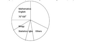
In a certain school, the lesson periods for each week are as itemised below:
ENGLISH 10; MATHEMATICS 7; BIOLOGY 3; STATISTICS 4; IGBO 3; OTHERS 9.
Draw a pie chart to illustrate the information.
Solution:
Step 1: Construct a simple frequency table as shown below;
| SUBJECTS | Nos of Periods (F) | SECTORAL ANGLES
(Degrees) |
| English | 10 | 10/36 × 360° = 100° |
| Mathematics | 7 | 7/36 × 360° = 70° |
| Biology | 3 | 3/36 × 360° = 30° |
| Statistics | 4 | 4/36 × 360° = 40° |
| Igbo | 3 | 3/36 × 360° = 30° |
| Others | 4 | 4/36 × 360° = 40° |
Step 2: construct a pie chart using the Sectoral angles above, with a protractor
iii. THE HISTOGRAM: A Histogram is a statistical diagram, which involves the use of rectangular bars to represent collected data. The bars in the Histogram are also of the same width, while the height of each bar is proportional to the frequency. The bars in the histogram are not to be spaced at all, like those of the bar chart, as mentioned above. A histogram is very similar to a bar chart. The Histogram is mostly used for grouped data.
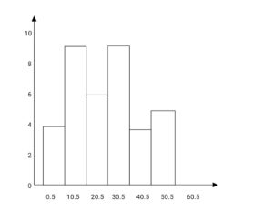
Example: Construct a Histogram for the distribution below:
| Class Interval | 1 – 10 | 11 – 20 | 21 – 30 | 31 – 40 | 41 – 50 | 51 – 60 |
| Frequency | 3 | 9 | 6 | 9 | 3 | 5 |
CLASSWORK: The Table gives the number of hours per week allotted to each subject taught at a technical school.
| Subject | Maths | Technical Drawing | Woodwork | Mechanics | Science | Metalwork |
| Hours/week | 5 | 4 | 2 | 3 | 4 | 3 |
- Represent the information on a pie chart.
- Draw a bar chart to show the information

Third Term Mathematics Lesson Notes for Other Topics

Longitude and Latitude II
Explore lesson notes covering all topics.

Bearings
Explore lesson notes covering all topics.
Probability
Explore lesson notes covering all topics.

Graph Of Linear Inequality In Two Variables
Explore lesson notes covering all topics.

Application Of Linear Inequality In Real Life
Explore lesson notes covering all topics.

Statistics
Explore lesson notes covering all topics.

Probability
Explore lesson notes covering all topics.

Collection, Tabulation & Presentation of Grouped Data
Explore lesson notes covering all topics.

Area And Volume Of Frustum
Explore lesson notes covering all topics.

Surface Area And Volume Of Solid Shapes
Explore lesson notes covering all topics.

Area Of Sector And Segment
Explore lesson notes covering all topics.

Mensuration: Circle and It's Properties
Explore lesson notes covering all topics.
Statistics -Data Representation (Bar Chart And Pie Charts)
Explore lesson notes covering all topics.

Angles of Elevation And Depression
Explore lesson notes covering all topics.
Angles And Polygons
Explore lesson notes covering all topics.


Lesson Notes for Other Classes

JSS1 Lesson Note
The complete lesson note to guide your studies.

JSS2 Lesson Note
The complete lesson note to guide your studies.

SS2 Lesson Note
The complete lesson note to guide your studies.

SS3 Lesson Note
The complete lesson note to guide your studies.